A complete digital bank app redesign.
Nequi is the first digital bank created in Colombia, it currently has more than 13 million users, since its inception the company made a commitment to revolutionize the financial industry, creating a tool where people find the best way to use their money.
Since its creation in 2015, the application did not make any changes within its experience and had problems in usability and user interface. The current design was not optimized for all types of users (at the beginning Nequi was aimed more to a young audience) and as a fintech industry leaders we needed to have a solution that would adapt to the changing user needs.
As a starting point, we work on different teams within Nequi to understand users and the current products to be able to use these learnings and define a whole vision for the new app.
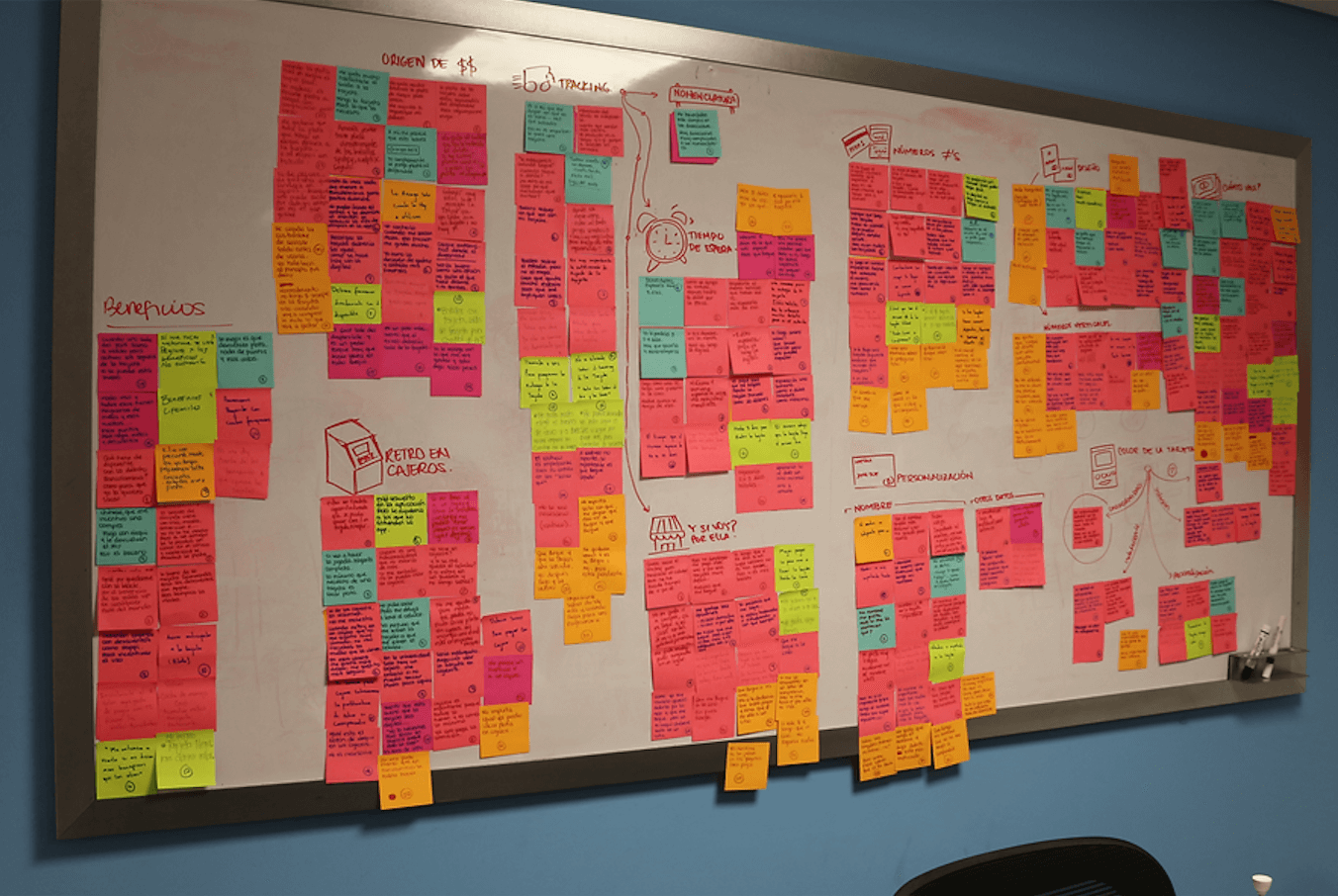
We based our research with activities such as diagnosis through design heuristics to understand the state of the app in relation to users. We did in-depth interviews with users and got quantitative research that came from the data team, this way we were able to find usability, experience, and interfaces component problems.
Our main research objectives were to understand the navigation process and the main pain points of our users with the help of our customer service team.
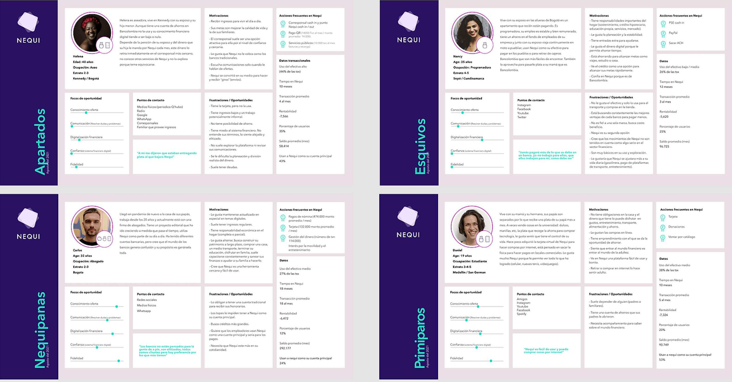
To highlight key research findings across all types of users and help us in our decision making, we used empathy mapping and archetype building based on transactional and qualitative data from the research. This helped us decisions based on their behavior and prioritize where our focus was.
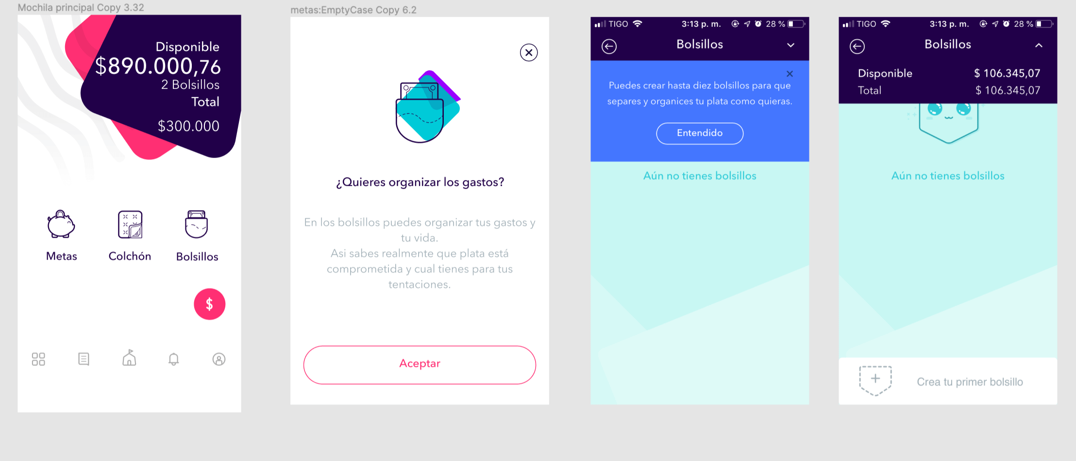
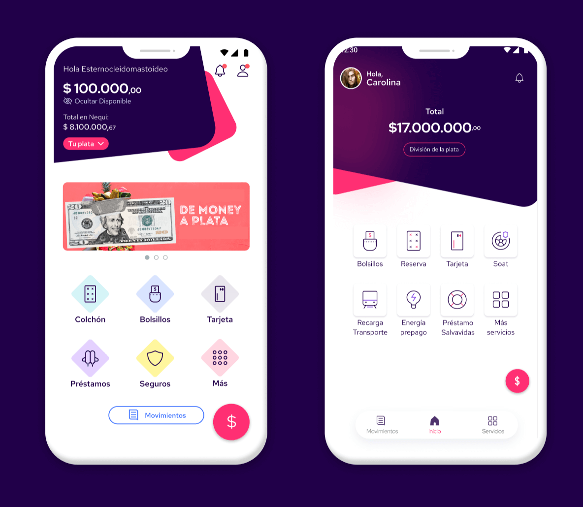
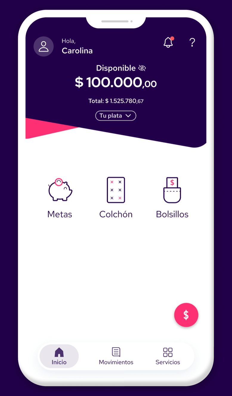
At this stage, we were able to establish our main solutions for our redesign that would address these issues: The solutions were focused on different moments of the application experiences such as: the signup, home screen, our marketplace to name a few.
To make this story short I will only focus on the redesign of the home screen and the decisions made during the ideation and prototype stage.
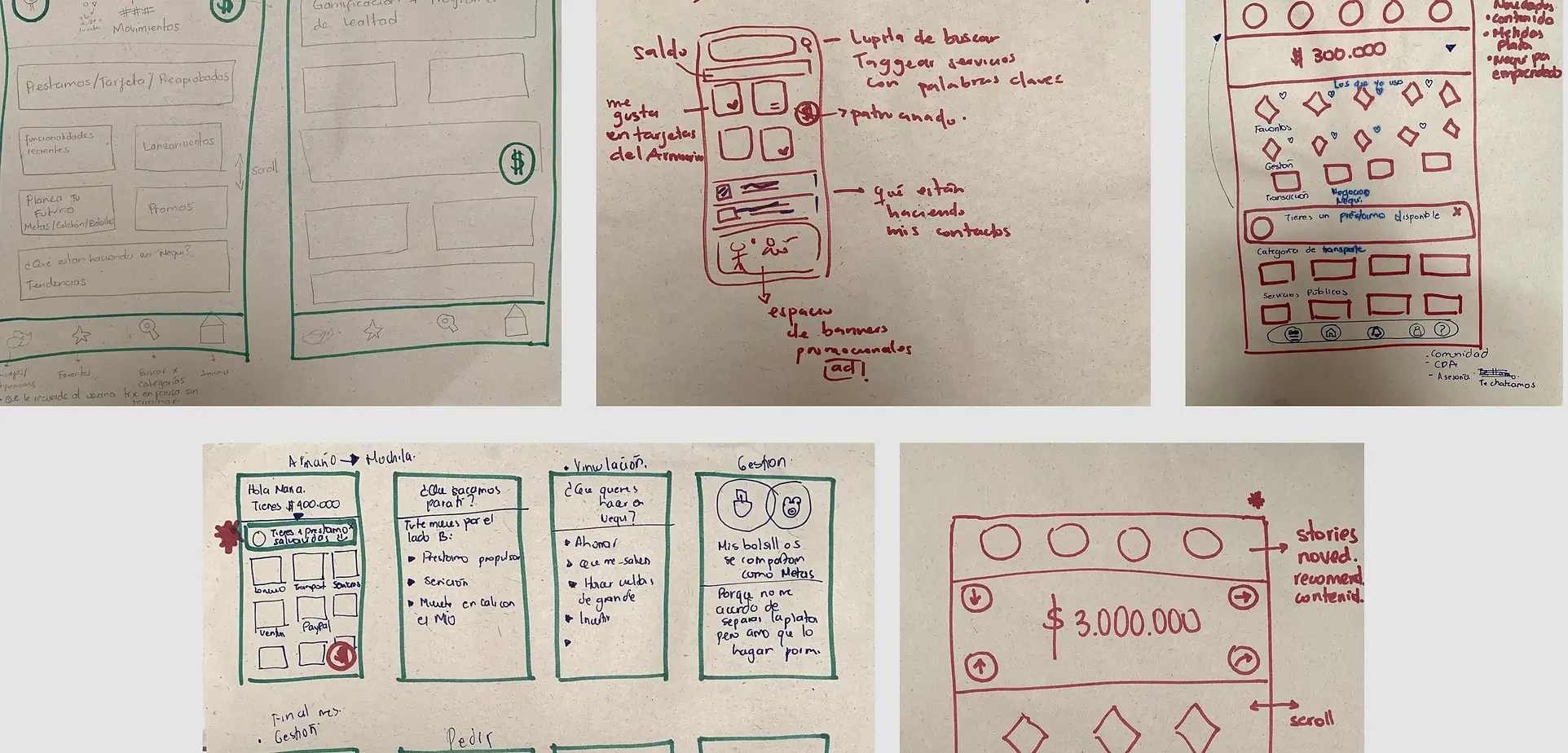
By doing this we quickly found the alternatives we could design.
Our first internal approach was to make different designs of the home screen that we could validate with our stakeholders before going to test with users.
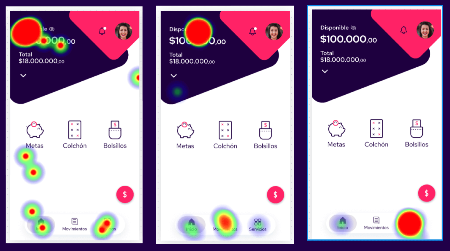
We sent this prototype to 500 users and 102 filled our remote test on which we wanted to test ease of use. Once we had some heatmaps of the goals we wanted to test we went back to the drawing board to make some changes and to quickly test again with users.
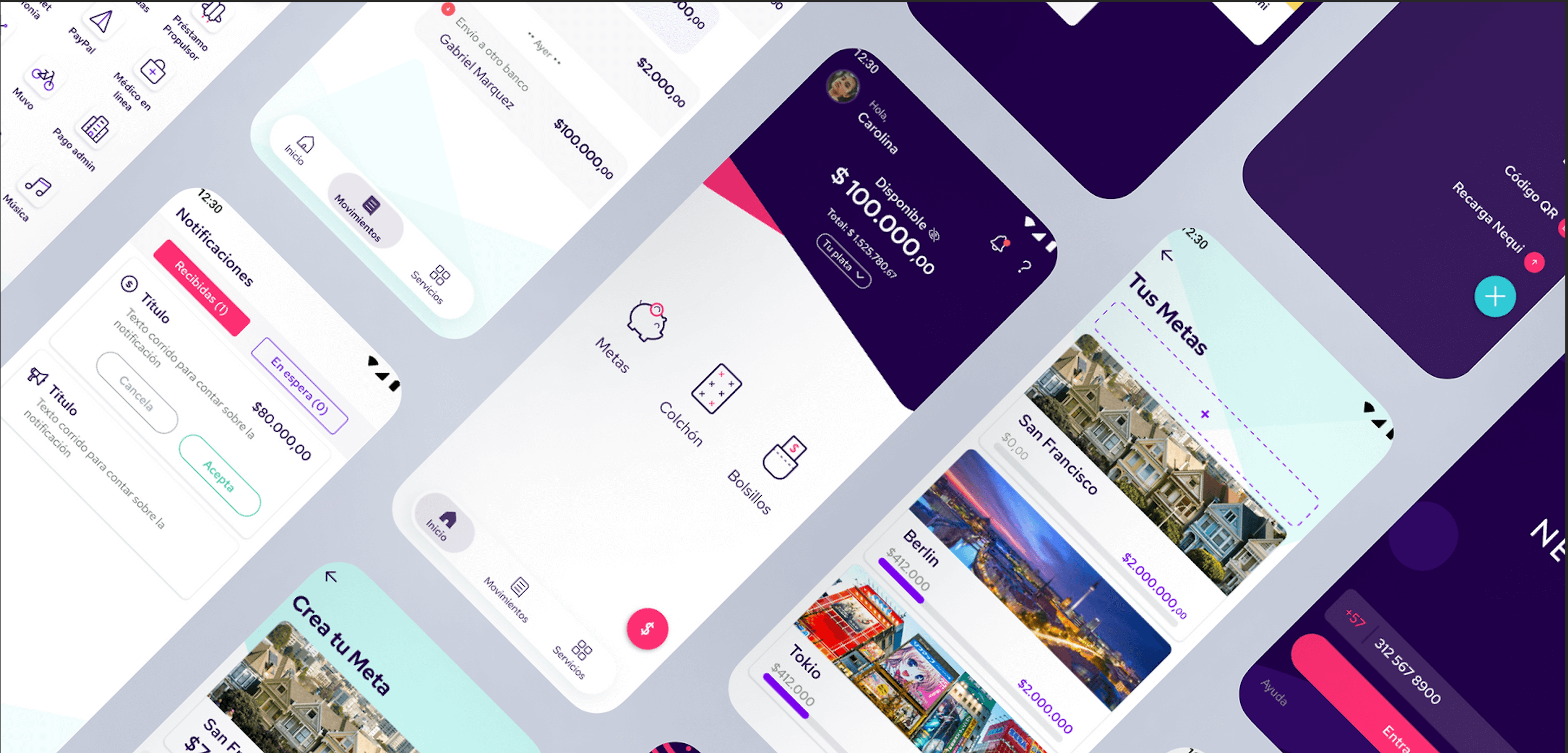
Even though I’m only showing the home screen ideation and prototype process this was made to all the main services and products of the app. The home screen had a bit more work and we could reply many of the findings here to other screens. But experiences like the marketplace and the signup went through the same design thinking process.
I hope you enjoy reading this design case and if you are in Colombia and use Nequi I hope you find Nequi easy and enjoyable. If not please let me know.
Disclaimer, all of this shown here is property of Nequi and Bancolombia I was part of the design team working for this solution. Posted september 2022.
Here you will find a short version of the design process made during the Nequi app redesign.
Design system, UI definitions, UX improvementes, icon design
2021 - 2022
Senior visual designer